Click on selected portion for a selective enlargement. [Pop Out Pages]

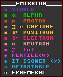
Colour Key for DECAY mode.
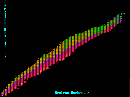
SEGRE CHART
The Segre Chart plots all the 2600+ nuclides on the same graph, using the x-axis to plot the number of neutrons, N, in the nucleus, and the y-axis to plot the number of protons or atomic number, Z, within the nucleus. Thus hydrogen occurs at the bottom left, whilst uranium near the top right. The stable nuclides are plotted in blue. Note the initial one to one proton to neutron ratio for low atomic numbers. The curve gradually flattens out for high atomic numbers as proportionally more and more neutrons are required to keep the nucleus stable due to the larger and larger coulombic repulsion of the protons. The nuclides colour coded red on the lower part of the curve are beta unstable and have a surfeit of neutrons, whereas those on the upper part of the curve colour coded yellow are inverse beta unstable and have a surfeit of protons.
On a Segre chart, isotopes (those with the same number of protons) lie on a horizontal line, isotones (those with the same number of neutrons) on a vertical line, and isobars (those with the same number of nucleons) on a 45° diagonal, thus \.
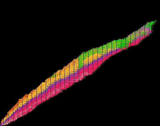
WHOPPING 2896x2160 Segre Chart! [POP]
You may need to pan it! Even I do on a 2560x1600 screen!
